ShopDreamUp AI ArtDreamUp

Deviation Actions


Suggested Deviants


Suggested Collections


You Might Like…


Featured in Groups


Description
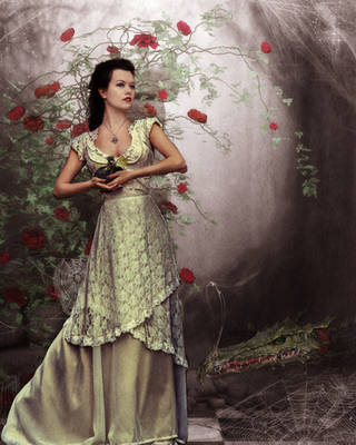
...she lives in the clouds and talks to the trees....
_______________________________________________
After spending a lot of time remaking and remaking this I decided that this is the best one, but I guess they are right - a lot of practice brings great results. It was firstly named as My name is Rose, but I wasn't sure about the name. I know that even this name is stupid, but if you have any suggestions feel free to tell me. (Smile)")
___________________________________________
Credits:
girl - *rammkitty-stock
window - =Cat-in-the-Stock
rose vines and candlestick - *unholy-stock
the rose in her hand - ~turtledove-stock
roses in her hair - ~Tigers-stock
clouds are mine
_______________________________________________
After spending a lot of time remaking and remaking this I decided that this is the best one, but I guess they are right - a lot of practice brings great results. It was firstly named as My name is Rose, but I wasn't sure about the name. I know that even this name is stupid, but if you have any suggestions feel free to tell me.
___________________________________________
Credits:
girl - *rammkitty-stock
window - =Cat-in-the-Stock
rose vines and candlestick - *unholy-stock
the rose in her hand - ~turtledove-stock
roses in her hair - ~Tigers-stock
clouds are mine
Image size
1100x825px 447.99 KB
© 2010 - 2024 xSimonneTx
Comments16
Join the community to add your comment. Already a deviant? Log In
ok this is my first critique so plz dont and i decided to stick to something i know, like photo manipulation, so plz dont slam me. Wen i first saw this i liked the overall dark shade and colors to the picture, as well as the initial idea. The tone really couldnt have been done any better but i noticed so many mistakes and the tone isnt enough to make the picture blend. The first thing i noticed was the where the length of the dress meets the stone was either erased with a soft eraser or overlapped in a layer blend, but it really stands out. I can see where u used the healing brush on the stone and lost alot of texture in the stone, witch really stands out. I can see various parts that u blurred to heavily like the pillar on the right and where her hair meets the stone. The stone that pertrudes out from under the dress on the left side is a different color than the rest of it. And though u might have done this on purpose, i would have evened out her body to make the legs line up straight with the head, but i can see clearly where the edge of the stone is under the dress near her feet so that works either way. The red on the roses blends perfectly with the rest of the picture, witch is extremely difficult to do with 2 colors that are that far apart so props for that. I love the color of the dress and especially the color of her skin. I thought she was a drawing before i opened the picture in photoshop and zoomed in. The roses on the outside of the windows were very nicely done and it looks convincing that they are coming through the end. Ive ran into all of these little problems many times and have come up with various effective methods of dealing with them so if u want some new photoshop tricks feel free to message me. Im sorry if this is harsh and i dont mean to insult u, but im assuming this is wat people want in a critique.